Inspired by Margintale’s post “ggplot2 Time Series Heatmaps” and Google Flu Trends I decided to use a heat map to visualize sick days logged by HeiaHeia.com Finnish users.
I got the data from our database, filtering results by country (Finnish users only) in a tab separated form with the first line as the header. Three columns contained date, count of sick days logged on that date and count of Finnish users in the service on that date.
date count(*) user_cnt
2011-01-01 123 12345
2011-01-02 456 67890
...
Below is R source code for plotting the heat map. I made some small changes to the original code:
- data normalization (line 9): this is specific to the data used in this example
- days of the week have to be 1..7, not 0..6 as returned by $wday (line 19): dat$weekday = as.numeric(format(as.POSIXlt(dat$date),”%u”))
- date format (line 31): week of year calculation required date conversion to POSIX dat$week <- as.numeric(format(as.POSIXlt(dat$date),”%W”))
- custom header for the legend (line 39): adding + labs(fill=”per user per day”) allows you to customize legend header
require(zoo)
require(ggplot2)
require(plyr)

dat<-read.csv("~/data/sick_days_per_day.txt",header=TRUE,sep="\t")</pre>
colnames(dat) <- c("date", "count", "user_cnt")

# normalize data by number of users on each date
dat$norm_count <- dat$count / dat$user_cnt

# facet by year ~ month, and each subgraph will show week-of-month versus weekday the year is simple
dat$year<-as.numeric(as.POSIXlt(dat$date)$year+1900)
dat$month<-as.numeric(as.POSIXlt(dat$date)$mon+1)

# turn months into ordered facors to control the appearance/ordering in the presentation
dat$monthf<-factor(dat$month,levels=as.character(1:12),labels=c("Jan","Feb","Mar","Apr","May","Jun","Jul","Aug","Sep","Oct","Nov","Dec"),ordered=TRUE)

# the day of week is again easily found
dat$weekday = as.numeric(format(as.POSIXlt(dat$date),"%u"))

# again turn into factors to control appearance/abbreviation and ordering
# I use the reverse function rev here to order the week top down in the graph
# you can cut it out to reverse week order
dat$weekdayf<-factor(dat$weekday,levels=rev(1:7),labels=rev(c("Mon","Tue","Wed","Thu","Fri","Sat","Sun")),ordered=TRUE)

# the monthweek part is a bit trickier - first a factor which cuts the data into month chunks
dat$yearmonth<-as.yearmon(dat$date)
dat$yearmonthf<-factor(dat$yearmonth)

# then find the "week of year" for each day
dat$week <- as.numeric(format(as.POSIXlt(dat$date),"%W"))

# and now for each monthblock we normalize the week to start at 1
dat<-ddply(dat,.(yearmonthf),transform,monthweek=1+week-min(week))

# Now for the plot
P<- ggplot(dat, aes(monthweek, weekdayf, fill = dat$norm_count)) +
 geom_tile(colour = "white") + facet_grid(year~monthf) + scale_fill_gradient(low="green", high="red") +
 opts(title = "Time-Series Calendar Heatmap - HeiaHeia.com sick days logged") + xlab("Week of Month") + ylab("") + labs(fill="per user per day")
P
Here are the results. Green indicates the healthiest days with lowest values of sick days logged per user, red indicates the worst days with highest values of sick days logged per user. It’s quite clear that there are seasonal peaks around February, and 2011 was a lot worse than 2012 (one should note that January-February of 2011 were exceptionally cold in Finland). It matches quite well with the coverage in the national press: Flu season reaching peak (Feb’2012), Employers grapple with sick leaves brought by flu wave (Feb’2012).
It’s interesting that there are less sick days logged on the weekends than on the work days, and traditional holiday month of July is the healthiest month of all.
(click to see full-sized image)
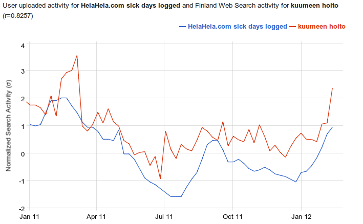
To get a more formal validation of the data logged by HeiaHeia users, I used Google Correlate lab tool to check that heat map results make sense. I uploaded sick days per user weekly time series and plotted a correlation with Google search queries for “kuumeen hoito” (treatment of fever in Finnish).

(click to see full-sized image)
Pearson Correlation Coefficient r between HeiaHeia sick days time series and Google search activity σ (both normalized so that mean is 0 and standard deviation is 1) is 0.8257 – this is a pretty good match.
Leave a Reply